Games
PCB
Archive
Chip
Archive
Cart/Box
Scans
Articles
Peripherals
Prototypes
Unreleased
Games
Rarities
Homebrew
Emulation
Links
Email: snes_central@yahoo.ca
Prototype Super NES and Super Famicom Designs |
 The Super NES had several designs before taking its final form. This page articles what the SNES could have looked like. Thanks to Retromags for letting me use their Nintendo Power scans for this article. By:
Evan G
|
The first mention of the Super Famicom in North America was in the September-October issue of Nintendo Power. The SFC was in the works for some time before this, but it was likely kept under wraps until it was nearing its Japanese release. The prototype version of the SFC that appeared in that issue was certainly near final, with the exception of the use of red buttons and switches.
 |
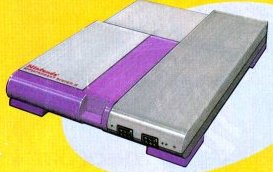
| Prototype Super Famicom shown in the September-October 1990 issue of Nintendo Power. |
An interesting article about how the Super NES design came to be is in the June 1991 issue of Nintendo Power. Lance Barr is responsible for the design for the US version of the SNES. According to the article, he was given free reign on the design, except he was instructed to that it should not look like a toy. He explains that the cart loading slot was rounded and the ventilation bay so that people could not place drinks on it. Another aspect of the US SNES was that the X and Y buttons were indented. Barr explained that the reason for this was to distinguish the face buttons and prevent confusion over which button needed to be pressed.
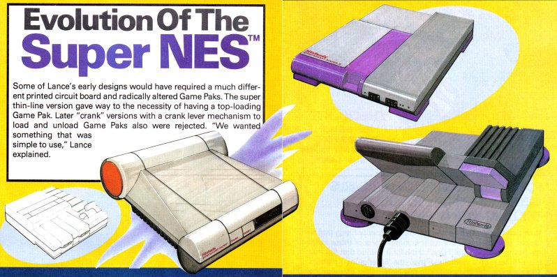 |
| Early US Super NES designs by Lance Barr |
Bibliography
- Nintendo Power, NES Journal - Super Famicom Announced in Japan, Publication date: September-October 1990, Volume: 16, Pages: 86
- Nintendo Power, Super NES Preview (details how the SNES design came to be, and some of the techincal aspects), Publication date: June 1991, Volume: 25, Pages: 44-47